Mútua Design System
mutua systems2026
- role
- Product Designer
- timeline
- Jun – Jul 2026
- team
- 2 Designers4 Engineers
- skills
- Design SystemsFigma VariablesDocumentationAI-Assisted Workflow
01overview
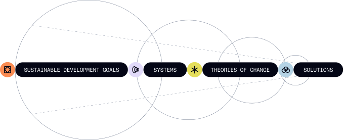
A data-intensive product with interconnected layers.
xxxxxxxxxxx
Visual artifact: product overview
02Problem
Main needs around the new system.
Product complexity
Different areas and user-flows require distinct structures without making each module feel like a separate product.
Consistency across modules
Shared variables, components, and usage rules need to remain consistent across modules as the product evolves.
AI-ready documentation
The system needs clear, structured documentation to support AI-assisted design and development workflows.
Design-to-code handoff
Component structure, states, and behavior need clear specifications so developers can implement the intended experience consistently.
03opportunity
xxxxxxx
xxxxxxxxxxxxxxxxx
04foundations
Defining the rules before building the library.
- 01I began by auditing Mútua's existing product foundations and how the rebrand had been applied, looking across color, typography, spacing, layout, and accessibility.
- 02Together with the PM, another designer, and the engineering team, we identified what to preserve, what to revise, and which gaps required new design decisions.
- 03I translated these findings into a coherent set of design foundations, defining the principles that would guide the system's visual language and organizing them into the Figma variable library.
Artifact #1
Foundations at a glance
xxxxxxxxx
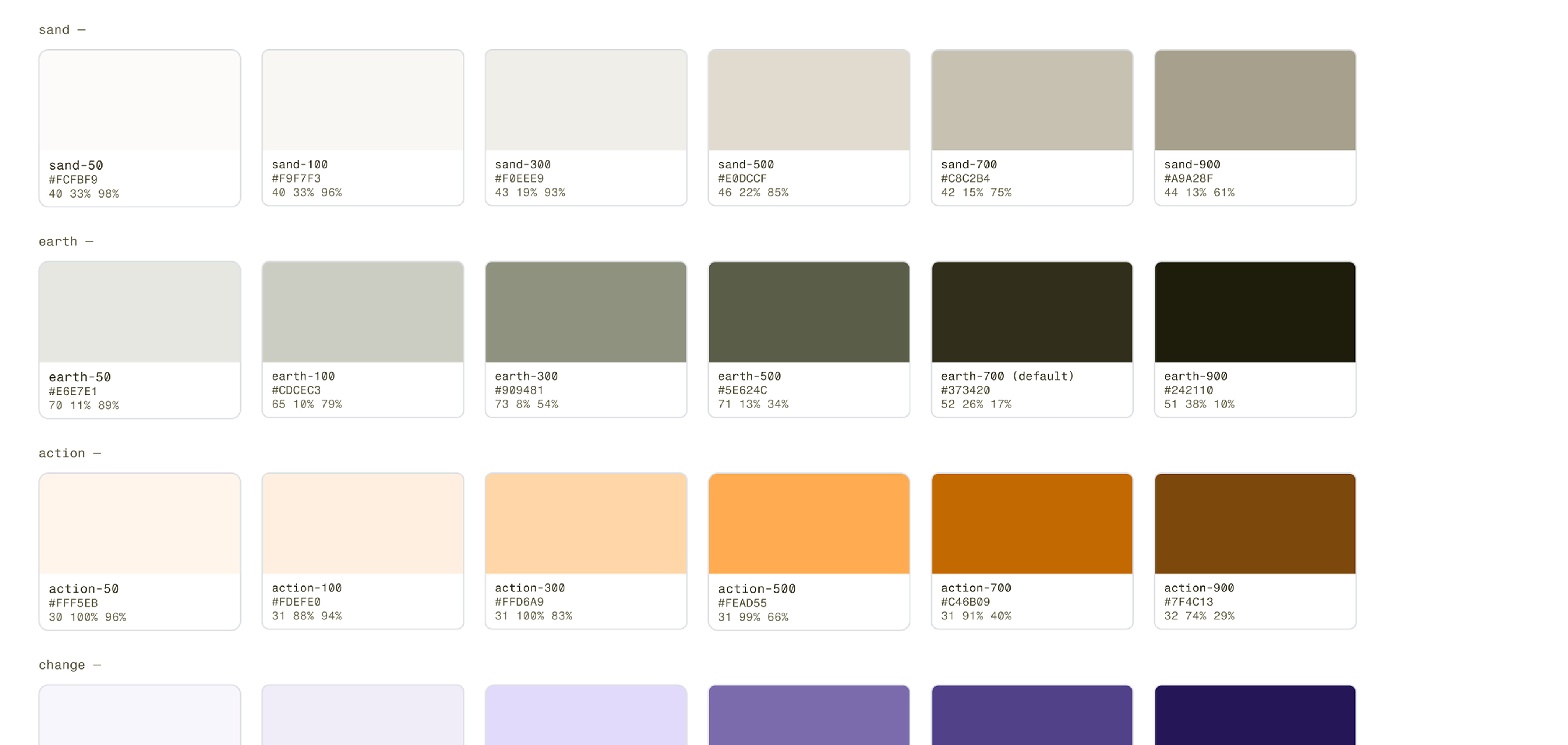
Selected primitive colour scales
/ action
50
#FFF5EB
100
#FCE6CF
300
#FFD6A9
500
#FEAD55
700
#C46B09
900
#7F4C13
/ change
50
#F8F6FC
100
#F0ECF8
300
#E2DBFA
500
#7D6EAF
700
#55458D
900
#2A1B5C
/ sky
50
#EEF7FB
100
#DDEFF6
300
#B5D3E5
500
#548FB1
700
#23597B
900
#053450
/ forest
50
#EAF4EA
100
#DCECDD
300
#B5DBB7
500
#4FA054
700
#306232
900
#19461B
/ SDGs
no-poverty
#E5243B
zero-hunger
#DDA63A
good-health
#4C9F38
quality-education
#C5192D
gender-equality
#FF3A21
clean-water
#26BDE2
Grid
Baseline
4px
Spacing
space-1
4px
space-2
8px
space-3
12px
space-4
16px
space-5
20px
Typography
Font family
Heading
Rethink Sans
Body
Inter
Label
Fragment Mono
Font scale
size-xs
size-sm
size-md
size-lg
size-xl
size-2xl
Border radius
sm
8px
md
12px
lg
16px
xl
20px
Accessibility standard
4.5:1
Minimum text contrast
Artifact #2
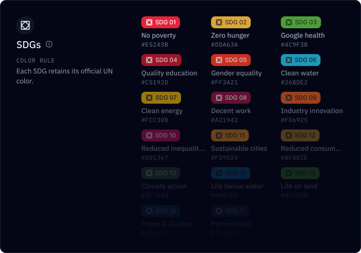
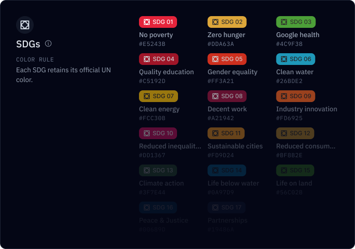
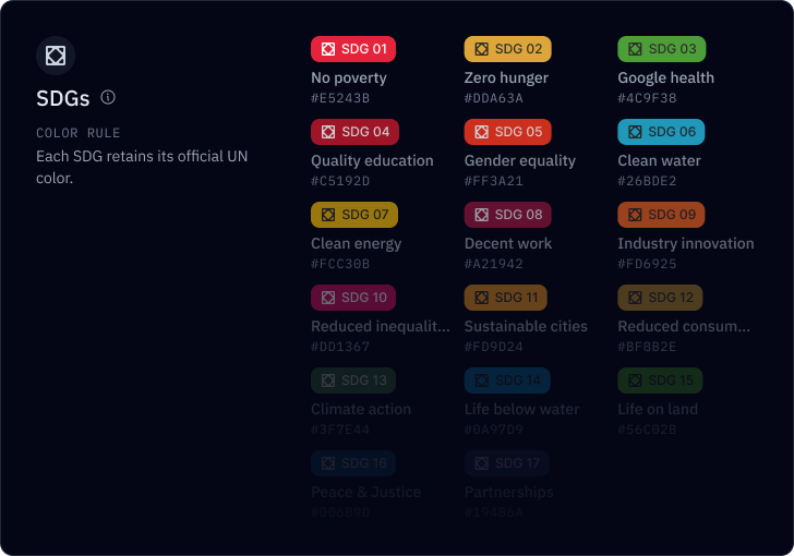
Color rules across the taxonomy
xxxxxxxxx
SDGs
Color rule
Each SDG retains its official UN color.
No poverty
#E5243B
Zero hunger
#DDA63A
Good health and well-being
#4C9F38
Quality education
#C5192D
Gender equality
#FF3A21
Clean water and sanitation
#26BDE2
Clean energy
#FCC30B
Decent work
#A21942
Industry innovation
#FD6925
Reduced inequalities
#DD1367
Sustainable cities
#FD9D24
Reduced consumption
#BF8B2E
Climate action
#3F7E44
Life below water
#0A97D9
Life on land
#56C02B
Peace & Justice
#00689D
Partnerships
#19486A
Systems
Color rule
Each of the nine systems has a distinct color.
#EEEA96
#BCABDD
#97C0EF
#FCC0A1
#A0D1D9
#D2ABC5
#D8D6BD
#FFD6A9
#B5DBB7
Theories of Change
Color rule
Each Theory of Change inherits the color of its associated system.
→ Food & Land
#EEEA96
→ Energy
#BCABDD
→ Water
#97C0EF
→ Mobility
#FCC0A1
→ Healthcare
#A0D1D9
→ Education
#D2ABC5
→ Ecosystem
#D8D6BD
→ Housing
#FFD6A9
→ Finance
#B5DBB7
Solutions
Color rule
Solutions remain color-agnostic because each can connect to multiple Theories of Change across different Systems.
Practical examples:
05Token Architecture
A two-tier architecture for design tokens.
xxxxx
Artifact #1
Inside the variable library
I organized the Figma variable library into two tiers: primitive tokens for foundational values and semantic tokens that define how those values are used across the interface.
Within the semantic layer, I grouped colors into four complementary categories: Ink, Surfaces, Border, and Icon, creating a consistent logic for how color is applied across different interface elements.
Artifact #2
Token anatomy
Within the semantic layer, I grouped colors into four complementary categories: Ink, Surfaces, Border, and Icon, creating a consistent logic for how color is applied across different interface elements.